Style Guide
Overview
Welcome to the BIOPROGNOS style guide. This page is designed to provide guidance on the use of BIOPROGNOS’ trademarks, logos, trade dress, web pages, screen shots, copyrighted designs, original content, or other brand features. If you still have questions after reading through our guidelines, please contact to [email protected].
Brand Strategy
Branding is about much more than the proper use of a logo or a color. It’s about consistent communication. About achieving a common look and feel. About speaking with one voice.
Why is branding so important? It’s an outgrowth of our mission. It reflects the continuous dedication to innovation, accuracy, and cost-effectiveness that form the fabric of our heritage. Read the BIOPROGNOS’ Mission and Vision statements.
Logo Background
Our logo is based in a Deciduous Tree. In the fields of horticulture and botany, the term deciduous means “falling off at maturity” and “tending to fall off” in reference to trees and shrubs that seasonally shed leaves, usually in autumn; and that they return to flowering in spring.
In this sense, as hair loss produced by chemotherapy and that grows back once the treatment is over and the cancer is defeated (something that is more likely to succeed in cases in which the cancer is detected at earlier stages), we think it was a good simile for our brand image. Besides, is well known that cancer is more related with aging (something also implicit in “maturity”).
Logo Guidelines
BIOPROGNOS only allows to include its logo in forms shown below: blue deciduous tree over white background; black deciduous tree over white background; and white deciduous tree over other background than white. Our logo is one of our most visible and valuable assets. It is key to our corporate identity, so we need to make sure it is used consistently.
BIOPROGNOS does not allow:
- Alter the logo in any way
- Use any part of the logo as part of another mark
- Redesign, redraw, animate, modify, distort, or alter the proportions of the logo
- Surround the logo with, or place in the foreground over, a pattern or design
- Rotate or render the logo three-dimensionally
- Add words, images, or any other new elements to the logo
- Enclose the logo in a shape or combine it with other design elements or effects
- Modify the size or position relationship of any element within the logo
- Add additional copy to the logo
Clear-space rule
Always position the logo for maximum impact and give it plenty of room to breathe. This will help to ensure our logo’s visibility and legibility.
The minimum clear space for the BIOPROGNOS logo is defined as the width of the tree base. Understanding the clear-space rule is essential, as it is also the standard for logo position and scale on most printed communications. In that regard, the clear space rule should be maintained as the logo is proportionately enlarged or reduced in size.
Claim
BIOPROGNOS’ claim “Non-invasive tests for early and accurate detection of cancer” should be always, if included, located so that it is clear that belongs to BIOPROGNOS, that is, allowing enough clear space around it and BIOPROGNOS’ logo.
Typography for Logo
Our logo uses Century Gothic font. This font is a sans-serif typeface released by Monotype Imaging in 1991, strongly influenced by the font Futura, although with a higher x-height. It is a digital typeface that has never been made into actual foundry type.
For all this we thought that this typography was ideal to express the principles that we consider must have a 21st century company: great use of new technologies, simplicity, effectiveness and respect for the environment.
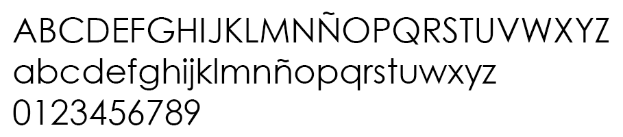
BIOPROGNOS only allows to use Century Gothic font together the deciduous tree in its logo.
Typography for Website
All our website uses Lato font. Lato is a sanserif typeface family designed in the Summer 2010 by Warsaw-based designer Łukasz Dziedzic (“Lato” means “Summer” in Polish). In December 2010 the Lato family was published under the open-source Open Font License by his foundry tyPoland, with support from Google.
In 2013-2014, the family was greatly extended to cover 3000+ glyphs per style. In the process, the metrics and kerning of the family have been revised and four additional weights were created.
In the last ten or so years, during which Łukasz has been designing type, most of his projects were rooted in a particular design task that he needed to solve. With Lato, it was no different. Originally, the family was conceived as a set of corporate fonts for a large client — who in the end decided to go in different stylistic direction, so the family became available for a public release.
When working on Lato, Łukasz tried to carefully balance some potentially conflicting priorities. He wanted to create a typeface that would seem quite “transparent” when used in body text but would display some original traits when used in larger sizes. He used classical proportions (particularly visible in the uppercase) to give the letterforms familiar harmony and elegance. At the same time, he created a sleek sanserif look, which makes evident the fact that Lato was designed in 2010 — even though it does not follow any current trend.
The semi-rounded details of the letters give Lato a feeling of warmth, while the strong structure provides stability and seriousness. “Male and female, serious but friendly, with the feeling of the Summer”, says Łukasz.
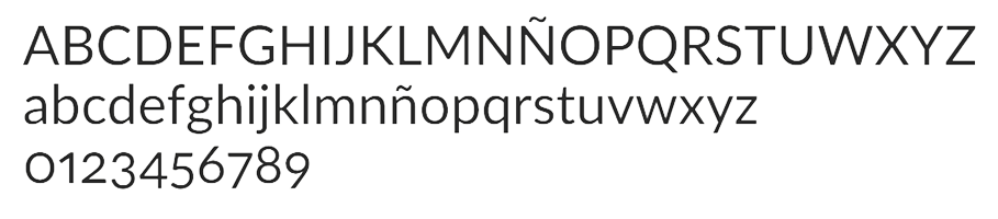
Lato consists of nine weights (plus corresponding italics), including a beautiful Hairline style. The Lato family now supports 100+ Latin-based languages, 50+ Cyrillic-based languages as well as Greek and IPA phonetics, something that fits perfectly with the internationalization needs of BIOPROGNOS.
Typography for Printed Materials
All our printed materials use the Arial; typeface. This font is one of the most widely used designs of the last 30 years. Drawn in 1982 by Monotype Imaging designers Robin Nicholas and Patricia Saunders for use in an early IBM; laser printer, Arial has become a staple for textual content. While some believe Arial has its design roots in the Helvetica typeface, its foundation is actually in the Monotype Grotesque; design, drawn at the turn of the last century.
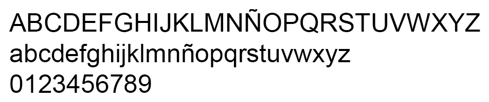
Besides, Microsoft chose to make Arial part of a suite of system fonts for the Windows; 3.1 operating system in 1992. That decision gave the design its most important send-off. Since then, Arial has been used on just about every computer and in every textual application imaginable. In addition to being bundled with Windows operating systems, it’s found on the Apple; Mac OS X; operating systems and is embedded in virtually all PostScript;-based laser printers. While only a few Arial fonts are bundled with operating systems and hardware products, there are a large number of variants in the family available to graphic communicators. More than 28 styles exist, which include a range of rounded and monospaced designs, something what more than satisfies the layout needs of the printed materials of BIOPROGNOS.
Although BIOPROGNOS provides all the necessary marketing material to its own partners and distributors, on those occasions when third parties develop such materials, BIOPROGNOS, only allows to use the Arial; typeface in any printed material related to company’s marketing.
Colors
One color is at the very core of our existence (beyond the black, essential for easy reading). Blue plays a vital role in establishing a clear and powerful image and in defining the BIOPROGNOS brand.
Blue is a color that is linked with confidence. Unlike red, which shows aggressive dominance, blue is related to a calm authority. Blue inspires trust, it is non-threatening and shows persistence.
Besides, blue is a color that suggests peace. It’s the color of the calm sea and the clear sky, both of which are linked to inner serenity, calm and clarity. Blue was also shown to slow heart rate and breathing, so it can be a good color to aid in meditation or relaxation.
Moreover, another characteristic of blue is that it is not a very emotional color. It can be described as aloof or snobbish. Just as it is associated with intelligence, it can be associated with being cold and rational to a point of showing little emotion.
Furthermore, we also added navy blue for signature. Navy blue refers to a very dark shade of blue. Navy blue is a cool color and emphasizesthe blue symbolism of confidence, while contributing importance and power.
For all this we thought that blue color was ideal to express what our algorithms to help in cancer diagnosis are: trust; confidence; tranquility and rationality.
Finally, we have selected light grey as background because grey is better for the eyes while reading digital content and also allows neutral surrounds avoid compromising chromatic adaptation (bright surrounds compromise dark color discernmen and dark surrounds compromise light color discernment).
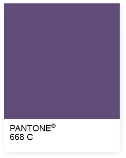
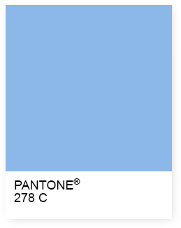
CMYK: 84/83/73/80
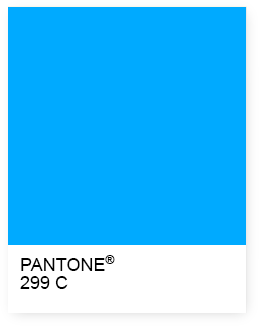
CMYK: 93/13/0/0
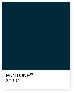
CMYK: 97/86/60/42
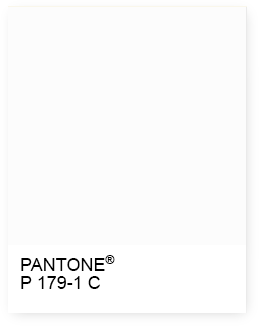
CMYK: 1/1/1/1
In addition, we also selected other colors to associate them with each of the different types of cancer for which we already have tests developed to help in cancer diagnosis. Each one is linked to a BIOPROGNOS’ sub brand, such as OncoBREAST Dx, OncoLIVER Dx, OncoLUNG Dx, OncoOVARIAN Dx, OncoPROSTATE Dx and OncoCUP Dx.
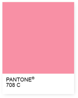
CMYK: 0/62/19/0
CMYK: 73/84/33/1
CMYK: 61/17/1/0
CMYK: 0/62/19/0
CMYK: 93/13/0/0
CMYK: 73/84/33/1
Brand Images
Moreover, we also selected several images to associate them with each of the different types of cancer for which we already have tests developed to help in cancer diagnosis. Each one is linked to a BIOPROGNOS’ sub brand, such as OncoBREAST Dx, OncoLIVER Dx, OncoLUNG Dx, OncoOVARIAN Dx, OncoPROSTATE Dx and OncoCUP Dx.


Partners
Any BIOPROGNOS’ partner can use BIOPROGNOS’ brand, logo, name, commercial name or trademark, while respecting all terms stated in this “Style Guide”; only together with “BIOPROGNOS Exclusive Partner”, “BIOPROGNOS Partner” or “BIOPROGNOS Dealer” (according each agreement) words in media support and only while the “Partnership Agreement” or the “License Agreement” is in force.
Final Disclaimer
All official logos, marks and symbols included are trademarks of BIOPROGNOS and the sole property of the company. Usage without the expressed permission of the company is strictly prohibited.
Violation of any guideline or representation, as determined by BIOPROGNOS, may result in the immediate termination of the right to use the mark, as well as immediate termination of any previous agreement. BIOPROGNOS reserves the right to address any improper use through all appropriate means, including legal action.